Ed-Tech
Working as a UX/UI designer and later on Senior Product Designer at KidsLoop, I have been able to participate in the design of a suite of KidsLoop products that will enhance the educational experience for school administrators, teachers, students, and parents.
Analytics and Reports
The analytics and reports page is where school staff and student guardians would get in-depth graphical reports on student performance and attendance based on real-time data collected during classes and assignments.
-
Figma
Jira
Confluence
-
GUI designer
Product Manager
Product owner
Front end/ Backend developer
Data analyst
-
Competitor Research
Information Architecture
Wire-frames
Interactive prototyping
Design reviews
UI design
Role
lead Product Designer.
Challenge
Being a digital platform, a lot of data is collected during online classes and assignments.
The challenge was to "Design useful data visualizations of the collected and analyzed data, teaching staff and guardians can use to help improve student performance and engagement. "
Design Process
Analyze the user requirements and features documentation from the Project Managers and Project Owners based on their conversations with users, data analysts, and data scientists.
Create wireframes and user flows.
After every design iteration, the design would go through a review and discussion with the relevant stakeholders.
I repeated this design process until all stakeholders were confident about the design and it catered to the essential user requirements and user stories.
Design Iterations
Analytics and Reports v1
Figma link: https://www.figma.com/file/OovyShZvnPkVHtjHUCLdh5/%5Blo-fi%5D%5BAnalytics-and-Reports%5D?node-id=1%3A2055
The requirements documentation had a lot of KPIs, graphs, and features. I had several meetings with the stakeholders to filter down requirements to critical KPIs relevant to the user. Keeping the visual data to a minimum would ensure that the platform delivers the data the user needs to focus on and that the user is not overwhelmed with information.
Analytics and Reports v1 was lo-fi wireframe to implement the filtered KPIs.
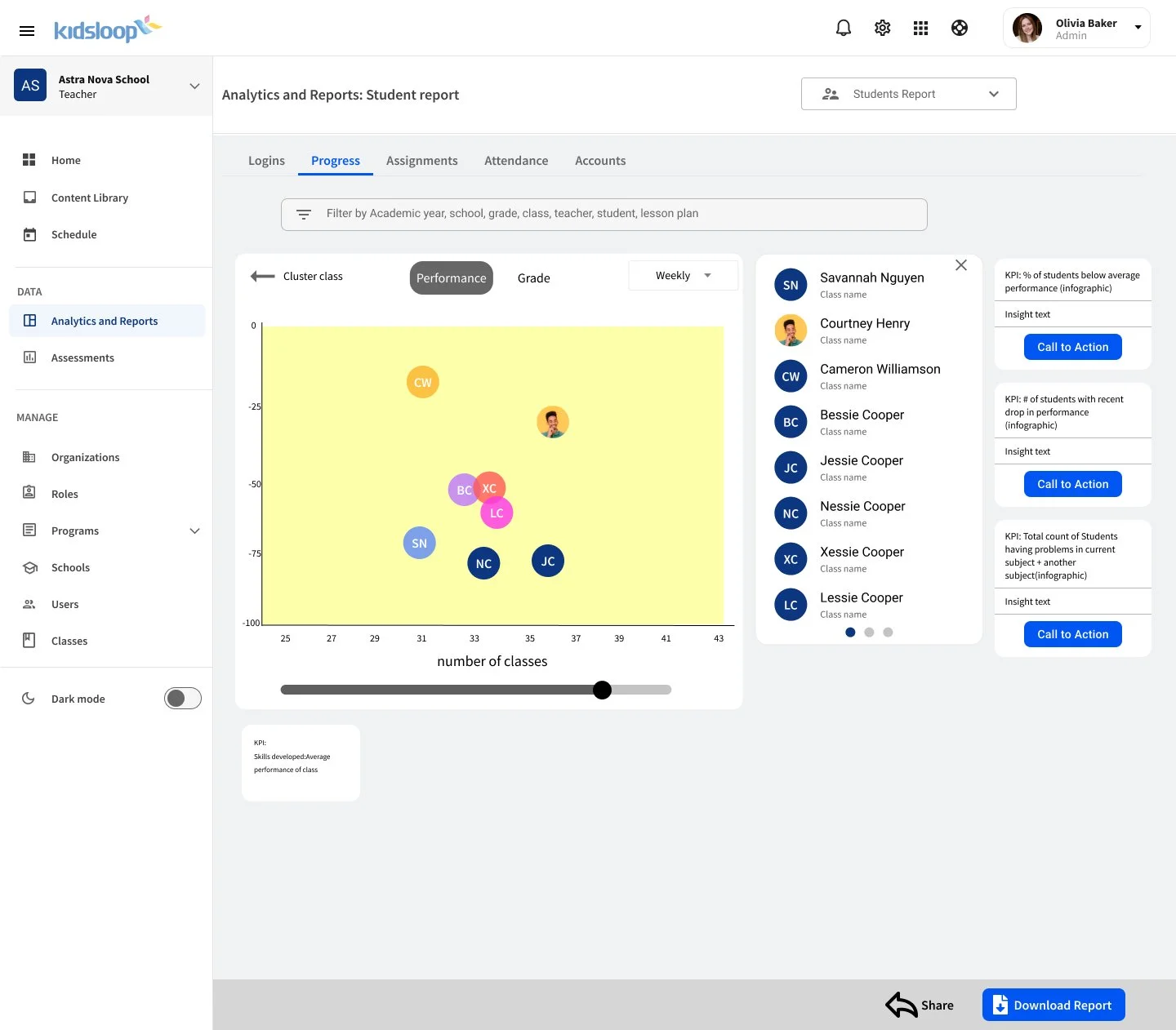
Analytics and Reports v2
Figma link: https://www.figma.com/file/OovyShZvnPkVHtjHUCLdh5/%5Blo-fi%5D%5BAnalytics-and-Reports%5D?node-id=14%3A1942
Key design changes:
Information Architecture. The change would make navigation to specific data and information easy and intuitive.
Added graphs to the KPIs. The primary graph type was changed to make it easier for users to understand the data represented.
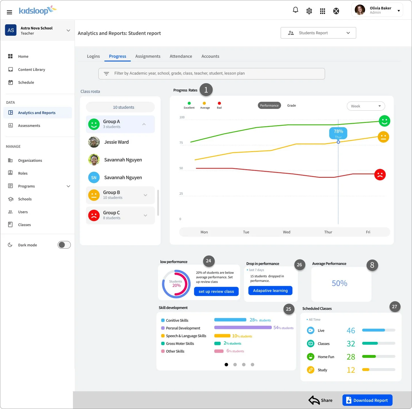
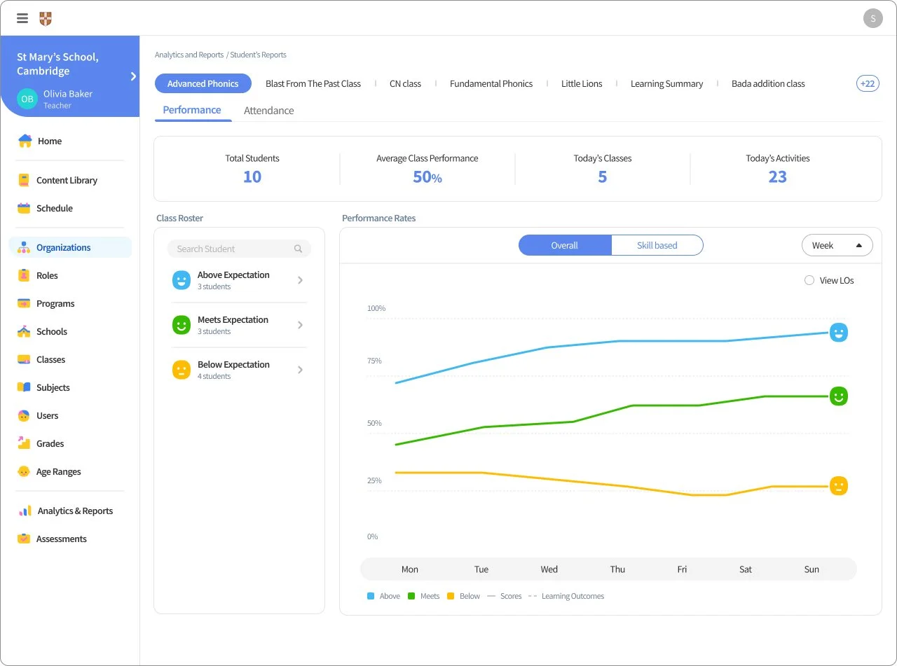
Analytics and Reports v3
Figma link: https://www.figma.com/file/OovyShZvnPkVHtjHUCLdh5/%5Blo-fi%5D%5BAnalytics-and-Reports%5D?node-id=1538%3A6184
Key design changes:
Improved the graph and data UI and page layout so anyone at any level could understand the data and information presented in the graphs.
Design constraints:
I had to resolve conflicts in graph design expectations between several stakeholders. Most stakeholders with data science backgrounds expected more complex graph designs to show to investors. As a UX/UI designer, I argued for a more user-centered design that was understandable by the users we were targeting. I was able to get the team to agree on a more user-centered design.
Conclusion:
Members from education marketing commented that this improved design and user experience would be easier and better to market to potential clients since it was simple to understand and focused on critical data that the users required.
KidsLoop CMS
KidsLoop CMS is a platform for school staff and third parties to find, edit, save and create interactive educational content.
-
Figma
Jira
Confluence
-
GUI designer
UX researcher
Product Manager
-
Competitor Research
Information Architecture
Wire-frames
Interactive prototyping
Design reviews
UI design
Role
Lead Product Designer. I was responsible for the complete re-design of the platform.
Challenge
School Staff, content creators, and publishers need to be able to find, purchase, create, edit, share, and save interactive education learning materials.
The challenge was to "Design a centralized library, content creation tools, and publishing platform that caters to multiple types of users in the education ecosystem."
Design Process
Meet with stakeholders to understand the user needs and requirements of the CMS and the pain points of the existing CMS.
Analyze user data documentation collected by UX researcher after conducting Interviews with the users.
Create wireframes and prototypes with regular design reviews with stakeholders. As the lead Product designer, I had to be able to discuss, test, and make design decisions on specific feature requests presented by the product, marketing, and education team.
I repeated this design process until all stakeholders were confident about the design and it catered to the essential user requirements and user stories.
Worked with a GUI designer to create custom brand UI and high-fidelity wireframes to hand over to the developers.
Design Iterations
CMS 1.0
CMS 1.0 was the first design of CMS in production before I got involved in the project.
Key Design issues:
Users complained that the Content creation process was very lengthy and tiresome.
The learning curve to understand and use the system was very high.
The Information architecture and navigation flow were not well structured. Users had a hard time trying to find files, menus, and features.
Some of the UI’s were redundant and repetitive.
The layout was not mobile responsive.
Visually the UI was not aesthetically pleasing.
Content Library v1
Figma link: https://www.figma.com/file/5dGLstdV4SDIr10LIIeh5I/%5Blo-fi%5DContents-Library?node-id=41%3A1596
Inspiration and reference designs for improving KidsLoop CMS came from studying cloud storage, video streaming services, and education content providers.
Since school staff was the primary user target for the content library, the Information architecture structure was designed regarding syllabus, programs, lesson materials, and lesson plans. This structure came as a result of regular meetings with marketing and education teams.
Key design changes:
Information Architecture. The change would make navigation to specific pages and information easy and intuitive.
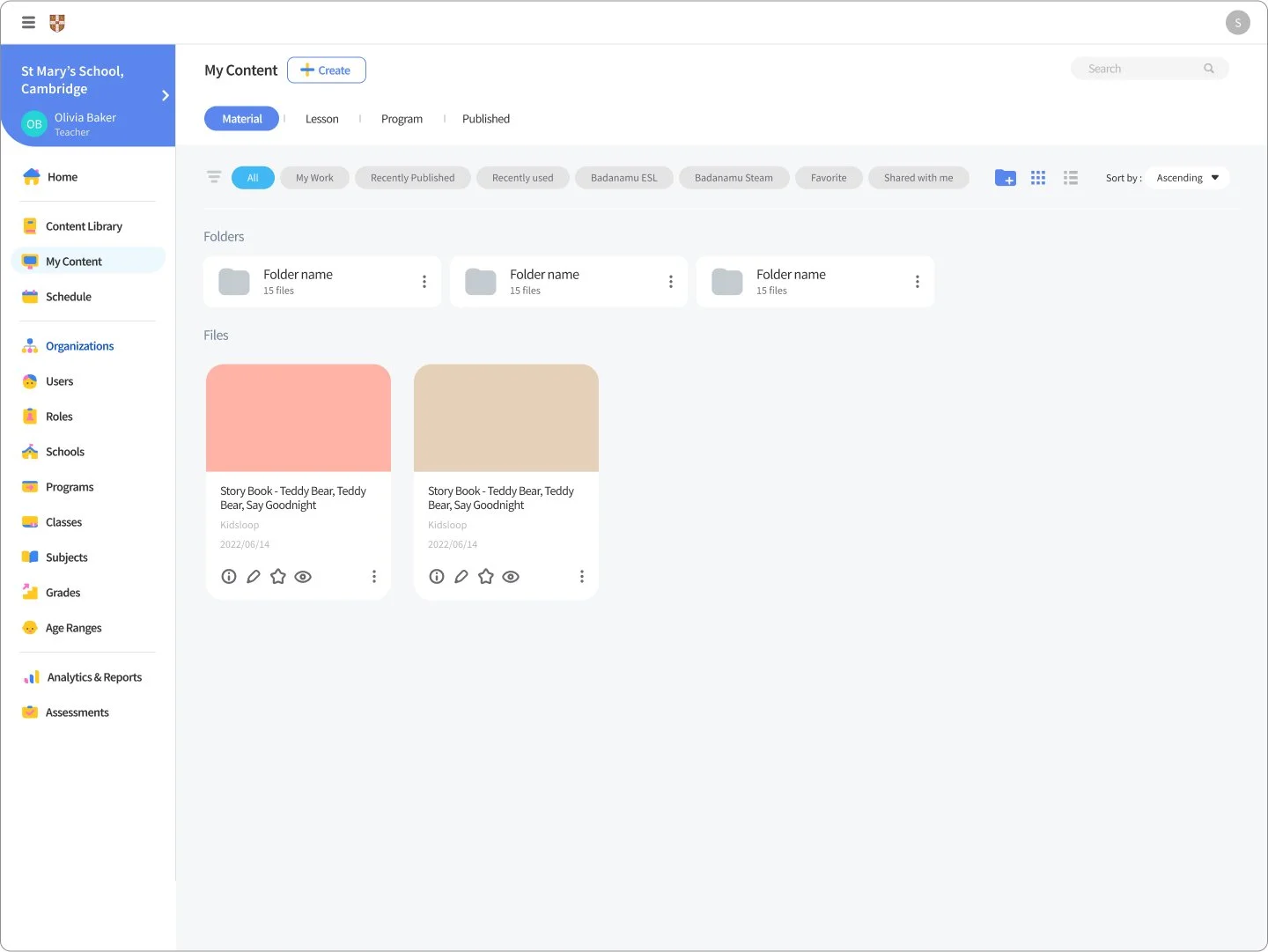
Separated the content library into two sections, i.e., the content library for content search and My Workspace for content creation. Having content library and content creation on the same level would result in complicated navigation, too many page depths, and a congested page.
UI design and layout we improved to be more intuitive with improved aesthetics.
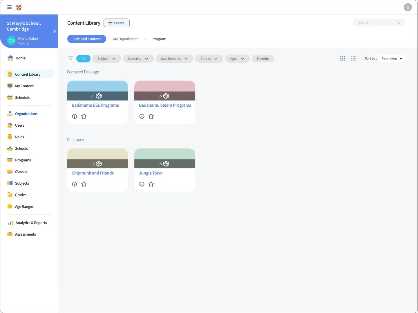
Content Library v2
Figma link: https://www.figma.com/file/5dGLstdV4SDIr10LIIeh5I/%5Blo-fi%5DContents-Library?node-id=187%3A12316
Key design changes:
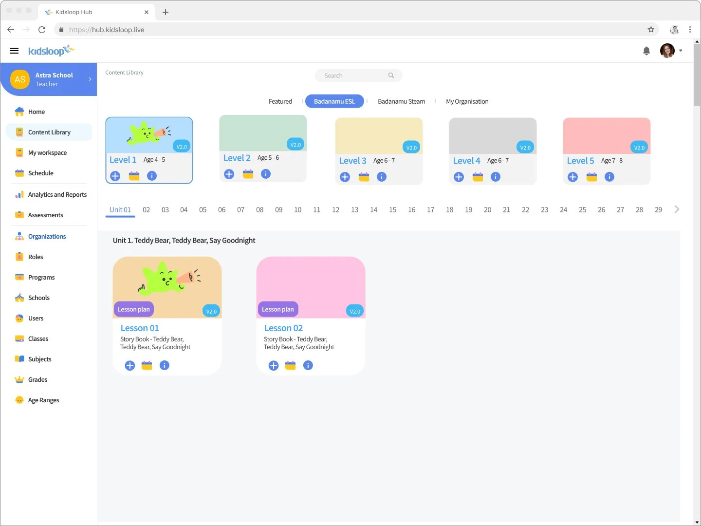
The Information architecture was changed to match the syllabus structure of the KidsLoop Badanamu syllabus structure.
The card UI, page layout, and tabs were changed to match the syllabus structure and platform features.
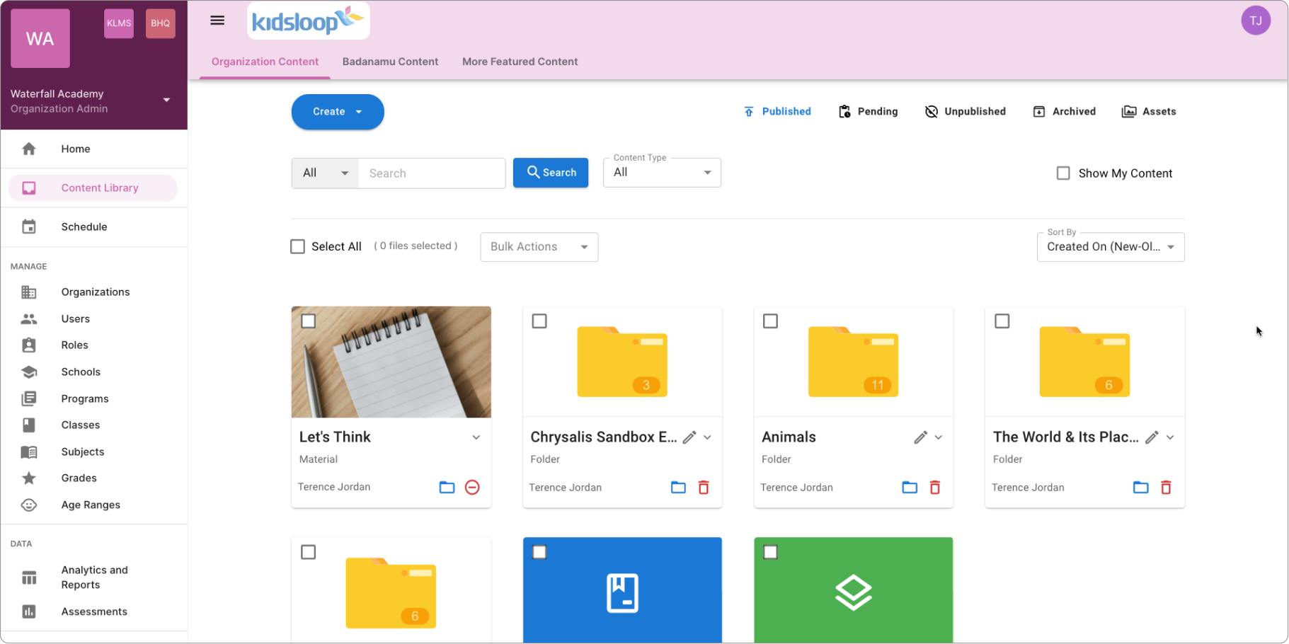
Content Library v3
Figma link: https://www.figma.com/file/5dGLstdV4SDIr10LIIeh5I/%5Blo-fi%5DContents-Library?node-id=1002%3A98943
Key design changes:
The previous Information architecture and design did not cater to third-party content creators who did not use the Badanamu syllabus structure. The Information architecture changed to follow a commonly used folder structure.
The card UI, layout, and menu tabs were changed to match the folder structure.
Added filters, view options, and sorting options to help users find content faster.
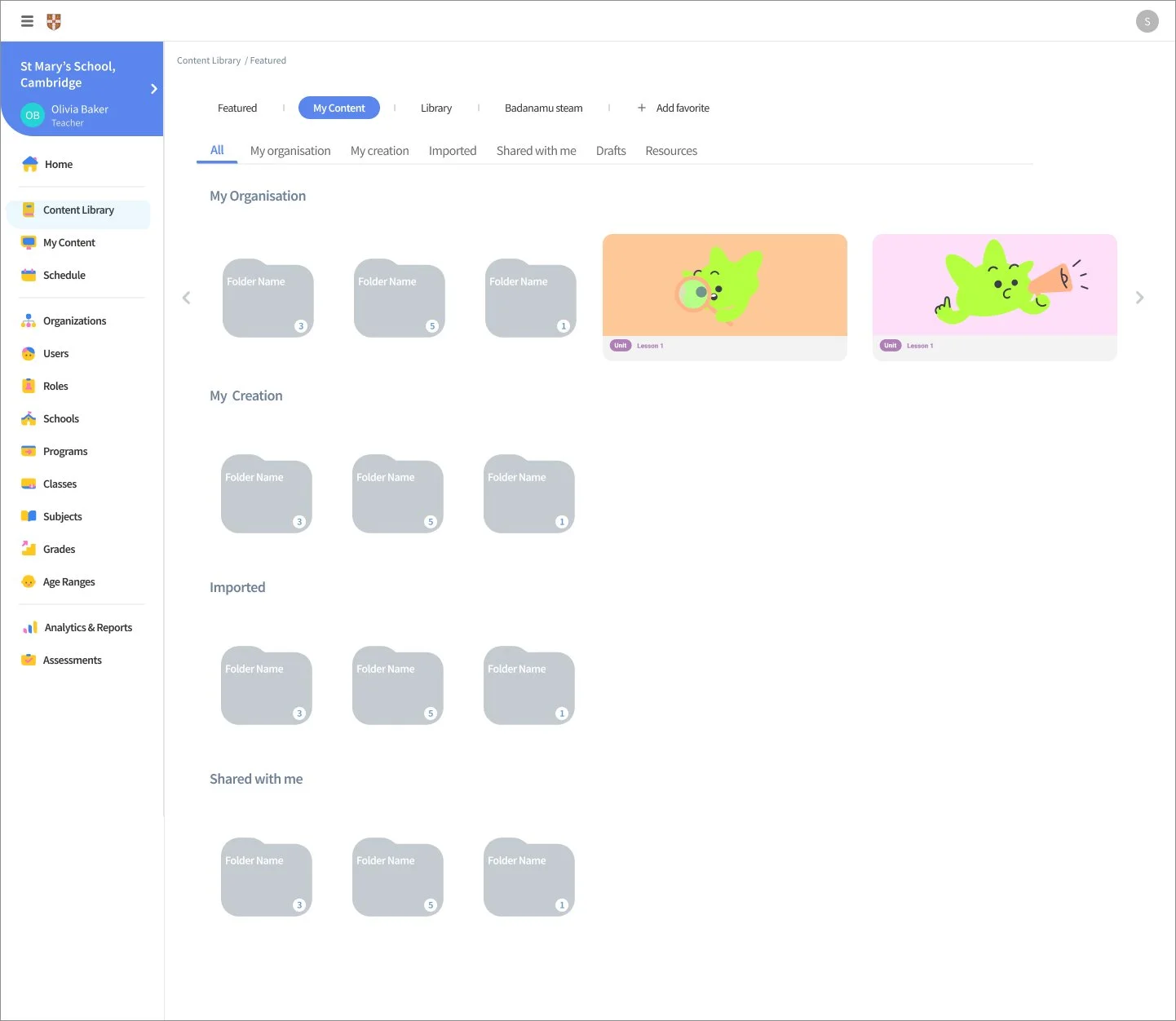
My Workspace v1
Figma link: https://www.figma.com/file/5dGLstdV4SDIr10LIIeh5I/%5Blo-fi%5DContents-Library?node-id=796%3A69017
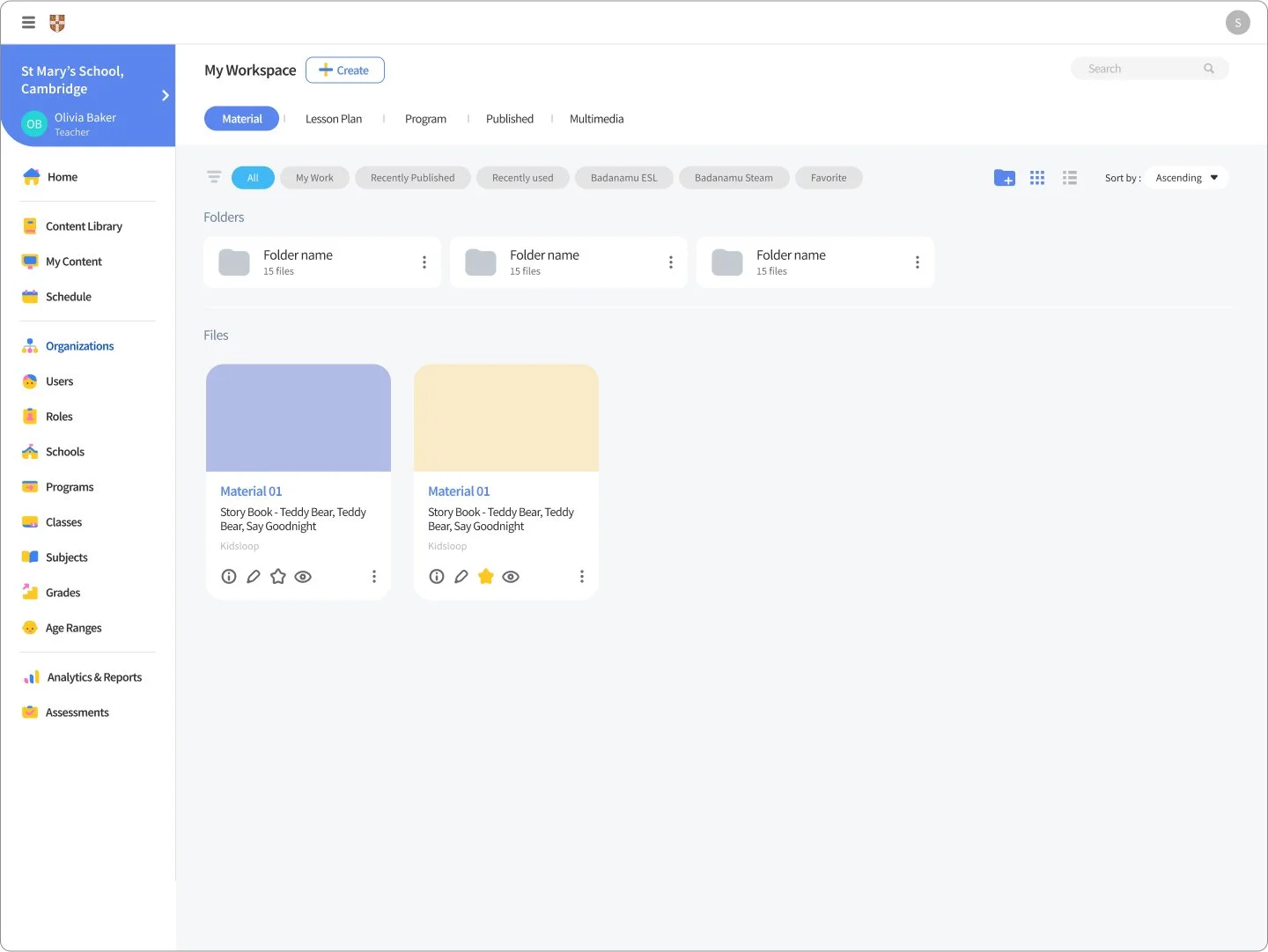
My workspace allowed users to create, edit, manage and publish teaching material. It was designed with the same folder structure as Content library.
My Workspace v2
Figma link: https://www.figma.com/file/5dGLstdV4SDIr10LIIeh5I/%5Blo-fi%5DContents-Library?node-id=1125%3A160528
Key design changes:
The filter types and menu tabs were changed to match a revised data structure.
Create Content
Figma link: https://www.figma.com/file/5dGLstdV4SDIr10LIIeh5I/%5Blo-fi%5DContents-Library?node-id=1174%3A187553
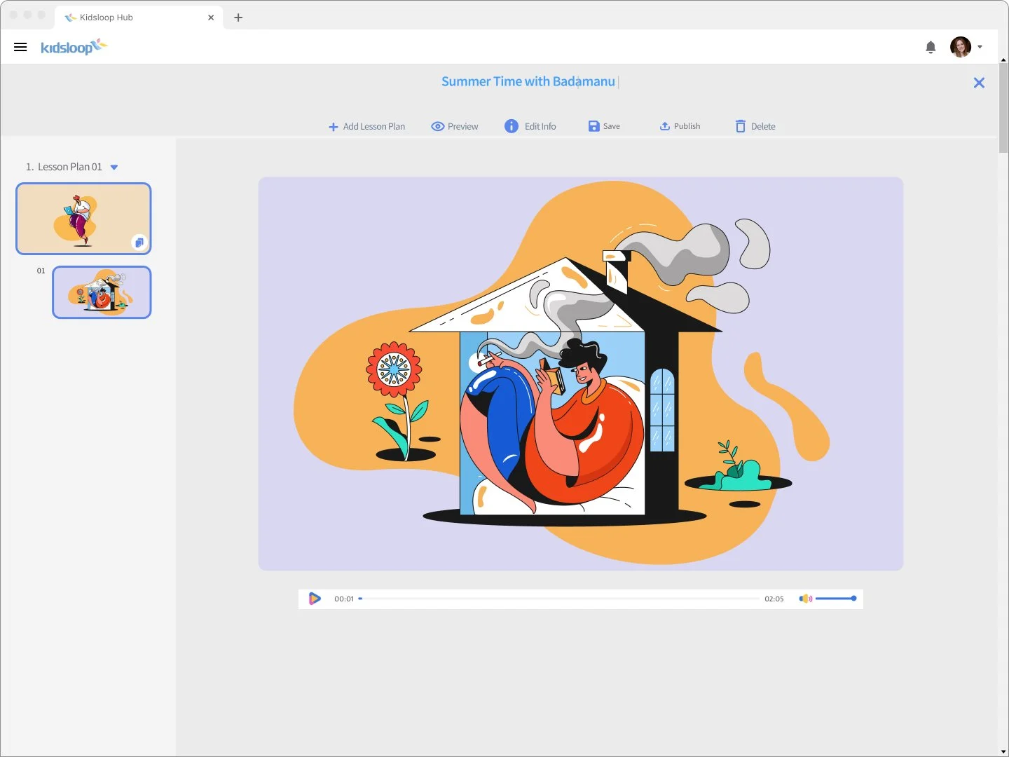
Users can create and edit lesson plans and materials on this page.
Conclusion:
Stakeholders reported that the new content library matched both business and client goals.
KidsLoop Live
KidsLoop live is a video conferencing platform that educators can use to conduct online classes with students. My role was to redesign the User Interface and overall user experience for students and teachers.
-
Figma
Jira
Confluence
-
Product Manager
Product Owner
Front End developer
Design/Front end Team lead
-
Competitor Research
Wire-frames
Interactive prototyping
In-house user testing
Design reviews
UI design
Role
Sole UX/UI designer. I was responsible for the visual and user-experience design of the platform.
Challenge
No Product designer was on the team when the first version of Kidsloop live, KidsLoop live 1.0, was developed. Technically the platform had the user-requested features working. However, there was a great need to work on the layout, user interface, Information architecture, and user experience to make it more intuitive and fulfill the user requirements.
The challenge was to "Design a Live interactive video conferencing classroom for teachers, students, and their guardians."
Design Process
The user requirements and features came from the Project Managers and Project Owners, who would log Jira Design tickets and confluence documents based on conversations with clients.
A design would go through a design review with the design lead, Developers, and Product managers giving their feedback and input for the next iteration.
In-house users would test the platform and give feedback on their pain points.
I repeated this design process until all stakeholders were confident about the design and it catered to the essential user requirements and user stories.
Design Iterations
KidsLoop Version 1.0
Figma link: https://www.figma.com/file/uon4myumxI0pKBiIIpsKYb/KidsLoop-Live-2.1?node-id=4231%3A813517
Function and feature-wise, KidsLoop live v1.0 was usable, but its many features were not intuitive for the user.
This version was not expandable to add new features from clients.
The UI was not visually modern and appealing.
KidsLoop Version 2.0
Figma link: https://www.figma.com/file/xwcvmmIxm3mHgOlU0bc6Me/LiveVersion-02?node-id=1%3A127
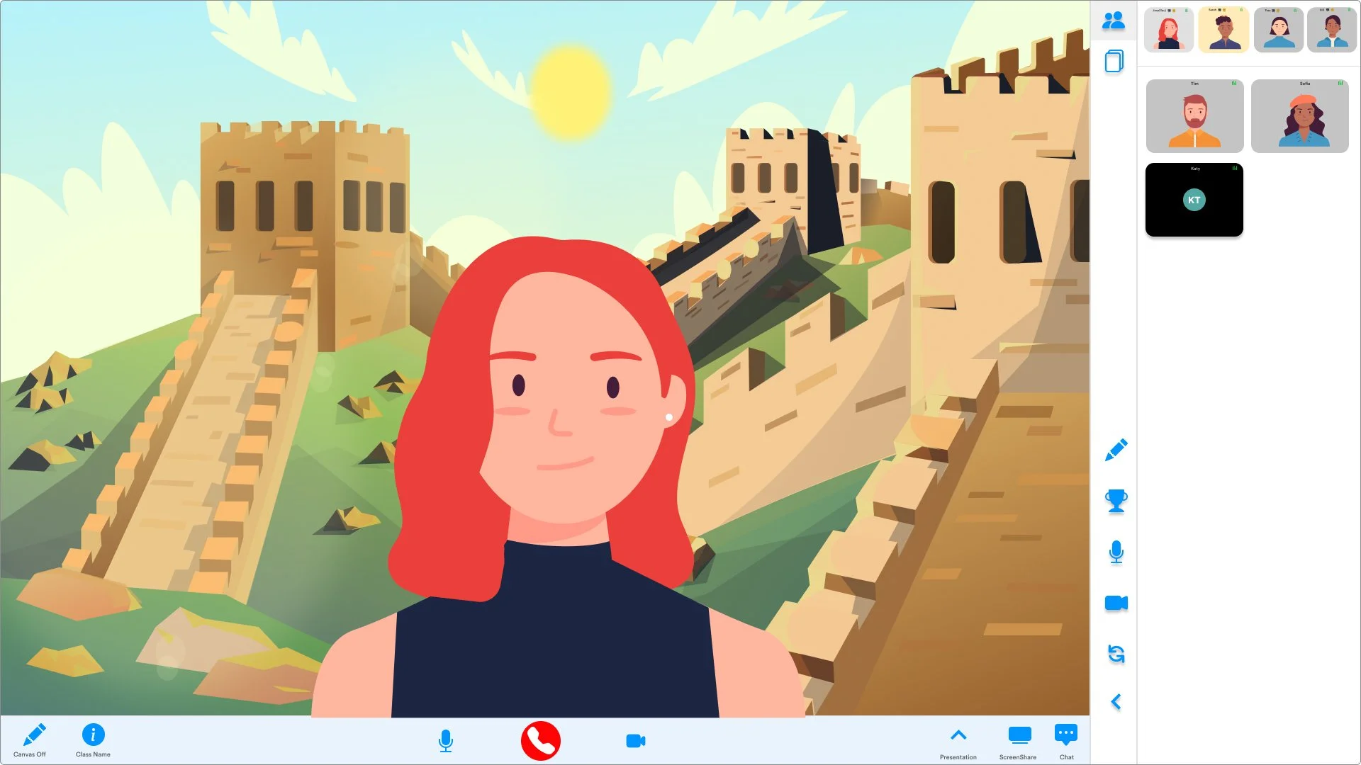
This design iteration, one of many iterations, took into consideration the User pain points and Client requirements.
Key design changes:
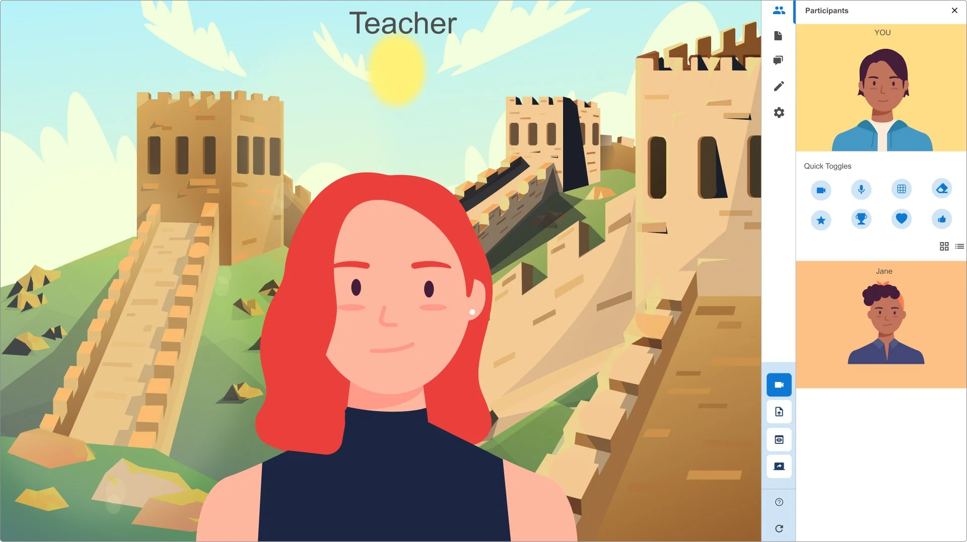
Separated the camera layout between teacher cameras and student cameras. Teacher cameras would be fixed to the top of the page, followed by student cameras. This puts the teacher’s camera always in view.
The camera size ratio changed to a smaller size. The camera size ratio allows more user cameras to fit and be in sight. The user story stated, “As a teacher, I want to see all my student’s cameras on the page.”
Added the bottom toolbar to include conventional UI and Frequently used features, including end call and mute functions. The bottom toolbar would make the platform more intuitive. Most video conferencing applications use this convention.
Changed the Information architecture to improve access to pages, information, and features.
Design constraints:
The already established underlining frontend backend infrastructure and timelines were significant constraints to how much the layout design could change.
As this rapidly developing platform was still at its infant stages, many feature requests kept pouring in to add to the Live platform. Some of these had to be declined or re-evaluated due to technical, design, and timeline restrictions.
KidsLoop Version 2.1
Figma link: https://www.figma.com/file/uon4myumxI0pKBiIIpsKYb/KidsLoop-Live-2.1?node-id=522%3A608877
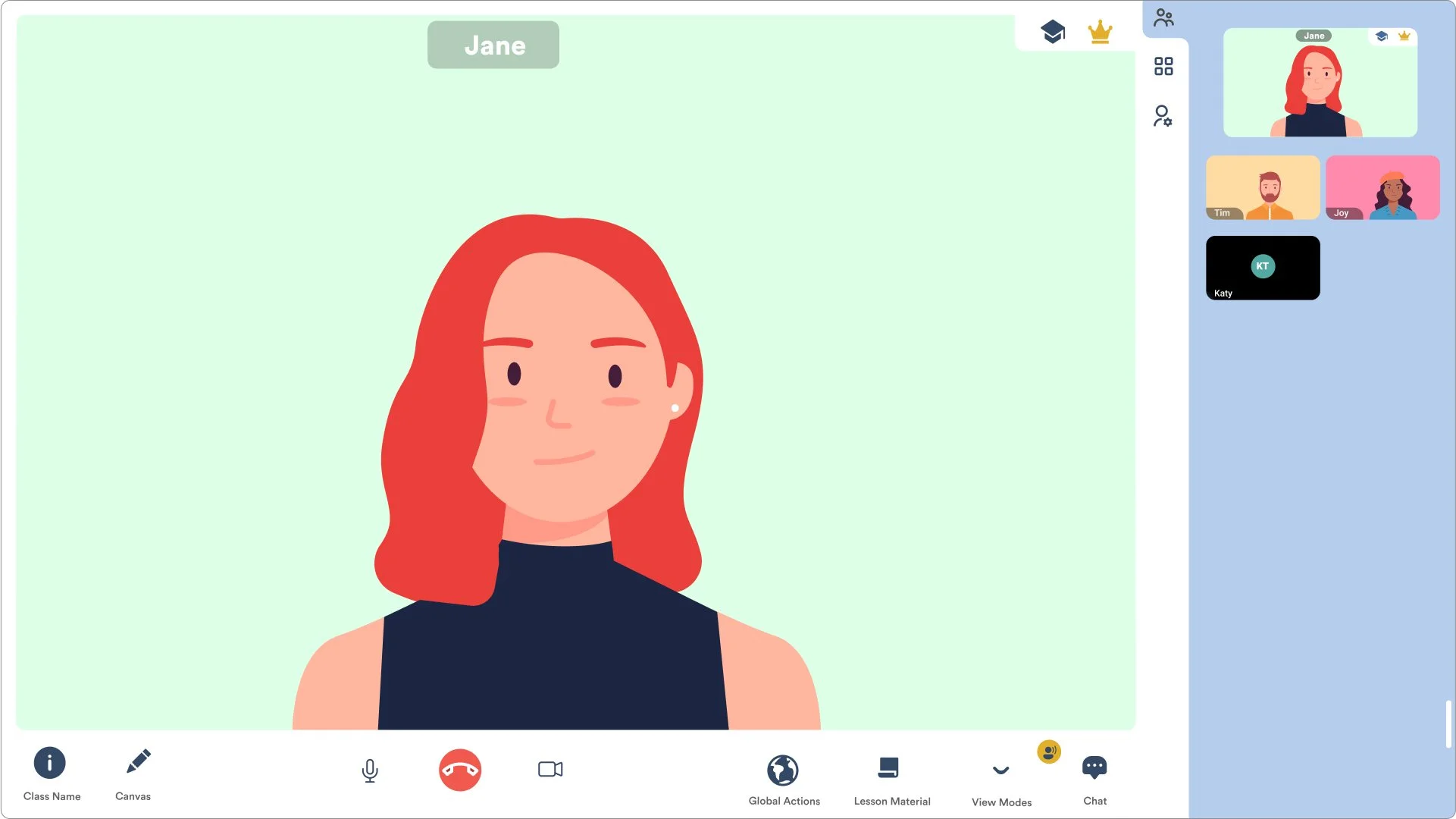
KidsLoop live 2.1 is the design that went into production.
Key design changes:
Improved the camera view size to make the teacher’s camera more significant.
Improved the Feature UI locations by adding more frequently used key features to the lower toolbar so the user could easily access the feature.
Changed Icon style and Color scheme.
The platform has many features to enhance the online classroom experience for both teachers and students. The information architecture was changed to make sure these features could all fit, be easily accessed, and have a clean UI look.
Conclusion:
Users and stakeholders reported improved usability of the platform and better UI aesthetics.
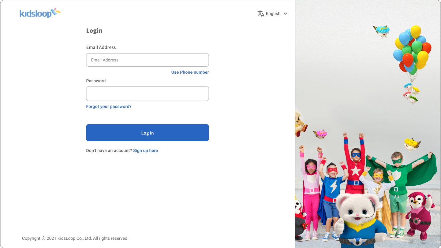
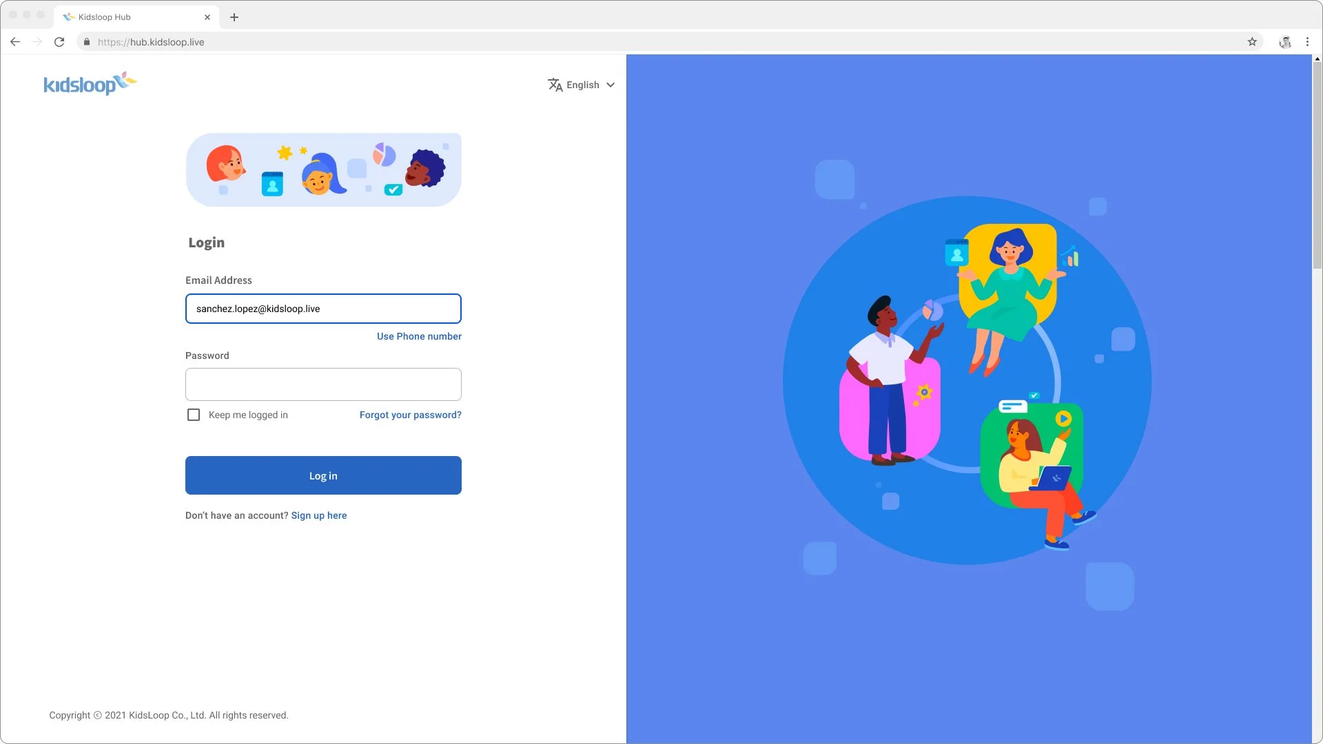
KidsLoop IAM
Kidsloop IAM (Identity and Access Management) was a project to Upgrade the user sign-up and sign-in experience and framework infrastructure.
-
Figma
Azure B2C
HTML/CSS
Jira
Confluence
-
GUI designer
Product Manager
Product owner
Business analyst
Front end/ Backend developer
InfoSec team
-
create User flows
Information Architecture
Wire-frames
Interactive prototyping
Design reviews
UI design
Role
Sole UX/UI designer on the team.
Challenge
The backend and frontend solution for the platform IAM was being migrated to Microsoft Azure B2C.
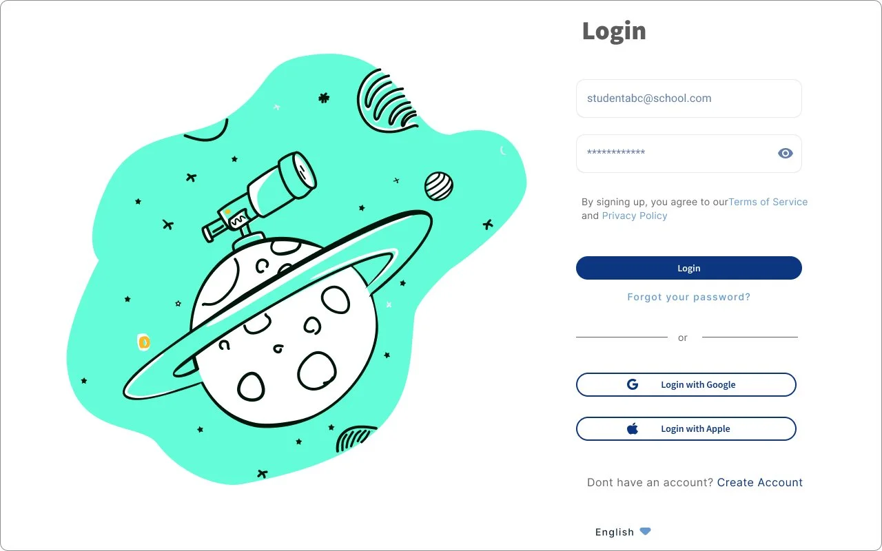
The challenge was to "Design a good “Create account” and “login” user experience and interface that works within the limits of Microsoft azure b2c and lines up with the business goals for user access and account management."
Design Process
Investigate and understand how Azure B2C works and design within its out-of-box solution. At the beginning of the project, the team had no front-end developer assigned to the project, so I did most of the testing by writing HTML/CSS code to test some of the front limits of the out-of-box solution.
Regular workshops to create and discuss user flows.
Create wireframes and have regular design reviews with the relevant stakeholders.
I repeated this design process until all stakeholders were confident about the design and it catered to the essential user requirements and user stories.
Design Iterations
Design concept v1
Figma link: https://www.figma.com/file/AGAKrV8ReCDZwx4DVt91LM/IAM-Project?node-id=4407%3A16210
Design concept v2
Figma link: https://www.figma.com/file/AGAKrV8ReCDZwx4DVt91LM/IAM-Project?node-id=2776%3A10506
IAM v1
Figma link: https://www.figma.com/file/AGAKrV8ReCDZwx4DVt91LM/IAM-Project?node-id=1322%3A1491
The out-box-box IAM solution from azure B2C had many constraints. The UX and UI had to be adjusted to cater to the front-end customization constraints, security, and organization goals.
IAM v2
Figma link: https://www.figma.com/file/AGAKrV8ReCDZwx4DVt91LM/IAM-Project?node-id=4408%3A18412
Key design changes:
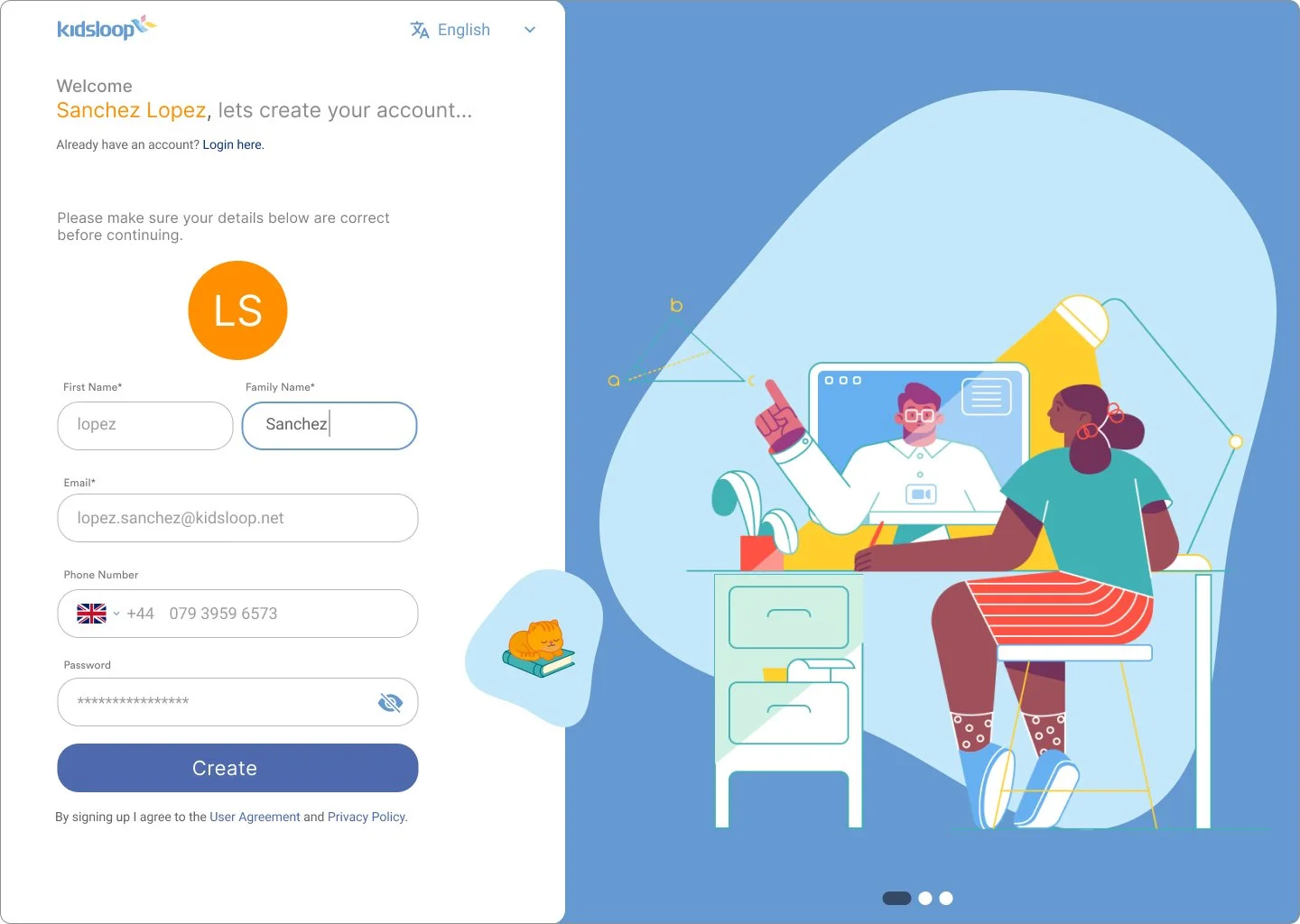
The illustration was changed to be more age agnostic and keep with the company brand style.
Design constraints:
Security was the highest priority, and so I had to design the UI and user flows to break any security protocols.
Some of the business and user requirements could not be implemented within Azure B2C solutions.
Conclusion:
The migration to Azure B2C and improved User journey made the login process faster and more secure.
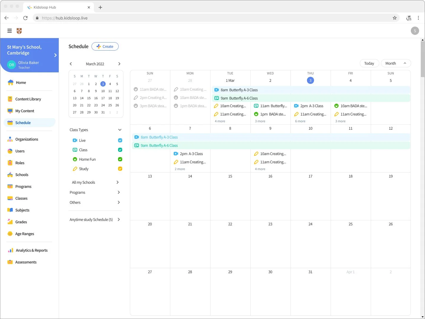
KidsLoop Schedule
With the schedule feature, school staff can schedule online classes and assignments.
-
Figma
Confluence
-
GUI designer
Product Manager
Product owner
Business analyst
Front end/ Backend developer
InfoSec team
-
Information Architecture
Wire-frames
Interactive prototyping
Design reviews
UI design
Challenge
An organization can have multiple classes and teachers assigned to various courses and schools. A teacher has to schedule online classes and assign homework to students in multiple schools and classes several times throughout the day.
The challenge was to "Design the schedule user journey to be effortless."
Design Process
Study the current KidsLoop schedule process and pinpoint the user pain points and what needs to be improved.
Create wireframes and have regular design reviews with the relevant stakeholders.
I repeated this design process until all stakeholders were confident about the design and it catered to the essential user requirements and user stories.
Design Iterations
Schedule v1
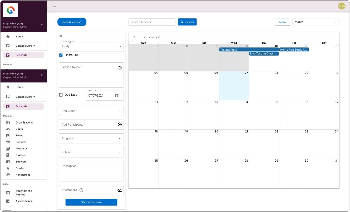
Schedule v2
Figma link: https://www.figma.com/file/iq7MxP8aPGHnqBVJiCt4K3/%5BSchedule%5D?node-id=2%3A405
Since the scheduling system backend framework was already developed, there were limitations on how much of the overall user experience and UI layout could be changed.
Key design changes:
Information Architecture and user flow. The change would make scheduling faster and more intuitive.
Improved the UI to have a more modern aesthetic and have a company brand.
Conclusion:
With the improved user journey and UI, teachers can make schedules for multiple classes, schools, and students more quickly and intuitively.
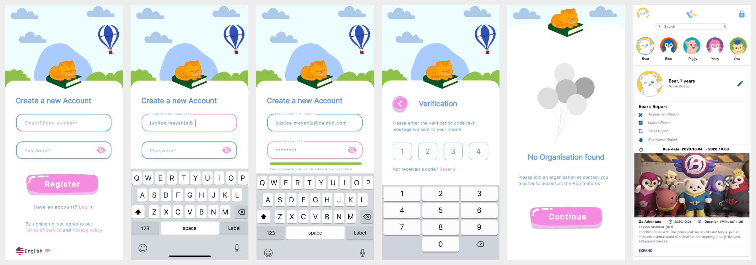
Student app
The designs below were a self-study I did to redesign the UI and UX of the login process and home page of the student app.
-
Figma
Figma Jam
Adobe Illustrator
React
-
Competitor research
User Flow
Wire-frames
Interactive Prototype
UI design research
Challenge
“Design a login page to be used by 3+ year children and their guardians.“
Design Process
Competitor research. Review how other child based and school based children applications implement the login process for both offline and online classes.
Create user flow of the login process
Design wireframes.
Design Iterations
App Login User flow
Figma Link: https://www.figma.com/file/VcnqZX8e1tqCPIrHnmbjmG/App-design?node-id=1%3A831
Mockup Designs
Figma Link: https://www.figma.com/file/AGAKrV8ReCDZwx4DVt91LM/IAM-Project?node-id=3133%3A13951